My group and I decided to work on a mobile app that simplified the travel process. We felt that is was something anyone could use to better their vacations and travels. But, all we had was the idea. This page will delve into the brainstorming and research that went into this project before we started to build the interface.
Concept Paper
After coming up with the idea for our app, my group and I needed to write a concept paper. The purpose of this was simply to propose our idea to our professor and get their approval. This way, we could move forward with our project with the confidence that it would get approved.
Business Plan
Once our idea was approved it was time to start some research. A business plan is a formal written document containing business goals and the methods on how these goals can be attained. My team and I each took on a section to research, and we worked separately to achieve the final product.
Name, Logo, Tagline
Around the same time as the business plan, we needed to create the app’s identity. While some of these things happened before others, this one assignment was still done relatively early in the process.
First, we decided on the name of the app. As you know, we ended up on Cloud Tours. The idea for this name came from the idea that your entire vacation itinerary could be online, or in the cloud. Also, one thing associated with travel is a plane, which flies through the clouds.
Secondly, we needed to come up with a creative and catchy tagline. Luckily enough, the ideas we all came up with collectively were all very similar. So, we ended up with “Explore the world your way”. This perfectly embodied our vision of creating your own vacations and getaways all in one place.
Finally, it was time to come up with a logo for Cloud Tours. For obvious reasons, we decided that the logos should include clouds and use the color blue, but other than that, we had free reign. This was also an individual assignment, so these were the three designs.
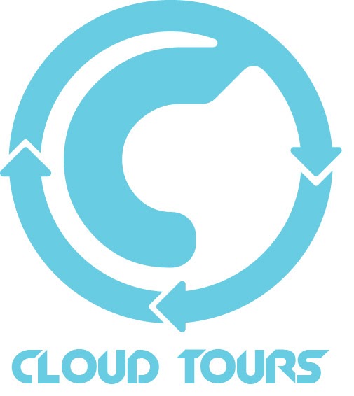
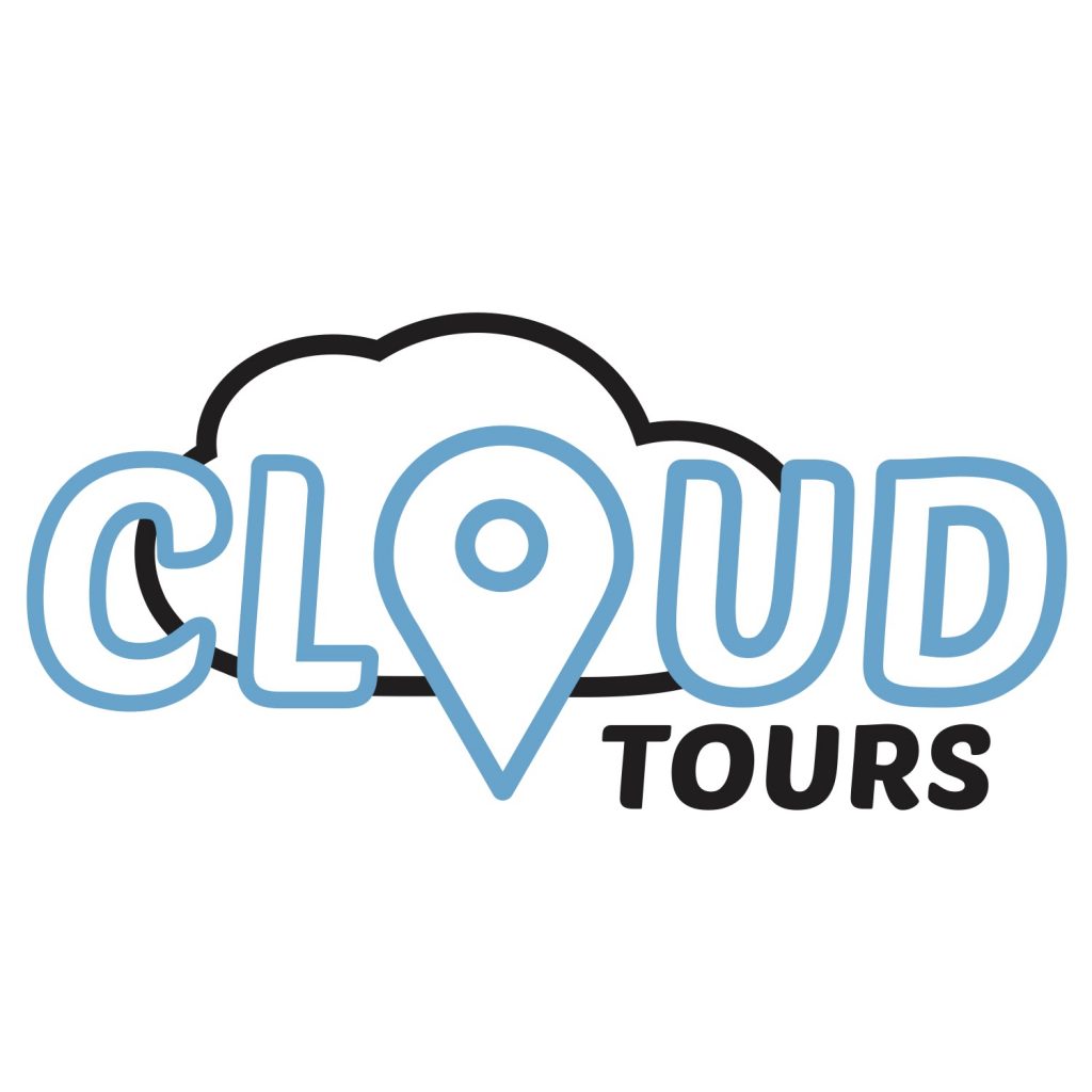
None of the designs we came up with were feeling right, but the design on the far right was something we felt we could work with. That was Anna’s design, so we asked her if she could keep developing it and let us know when she had a final logo done. This was the end result.
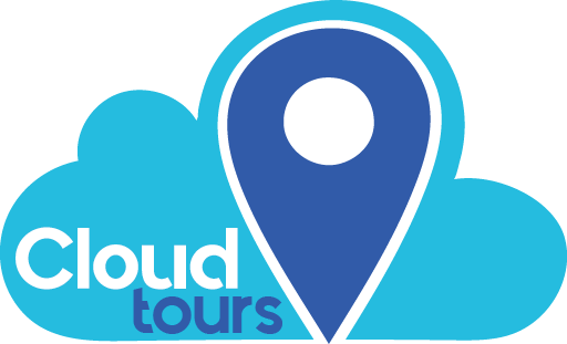
I loved the idea of not only having a main icon, but also a simplified version as well. The location icon in dark blue is currently being used for this website as it’s tab icon, and I love the way this whole design turned out. We even made sure to utilize the unique font in our later projects.
Swatches and Icons
The swatches are colors we intended to use with in our app. These came easily to us because of the logo already having two cohesive colors. But, just to make our palette more dynamic, we added a couple of other colors.
Also, we came up with a few icons that we planned on using in our design. These are not the only icons used, but they gave us a place to start.
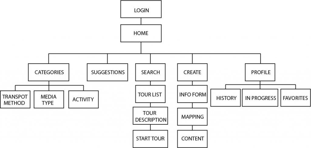
Sitemap
Finally, we needed to create a sitemap before working on the app’s digital wireframe. Not only is it useful for visualizing the layout for the app, but it also reminds us of what we need in our app and that we don’t stray too far from the end goal. It’s also very useful for rearranging pages so that the app can make the most sense for users.